


Eco-neighborhood
Eco-neighborhood – Bordeaux
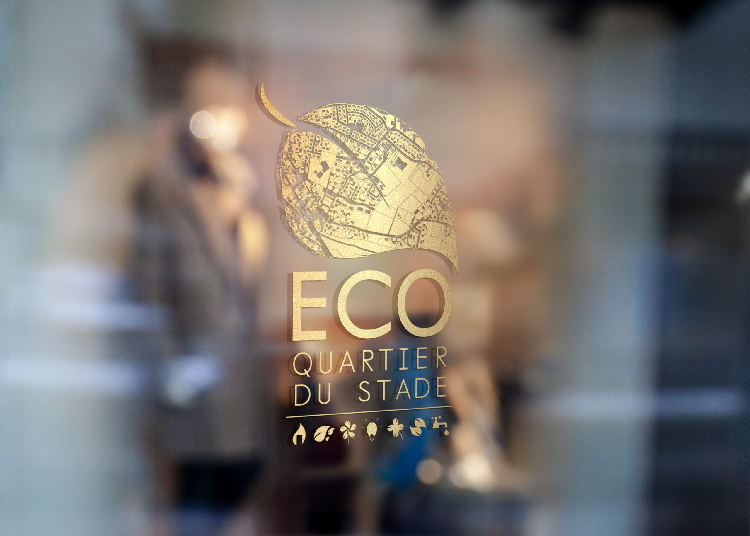
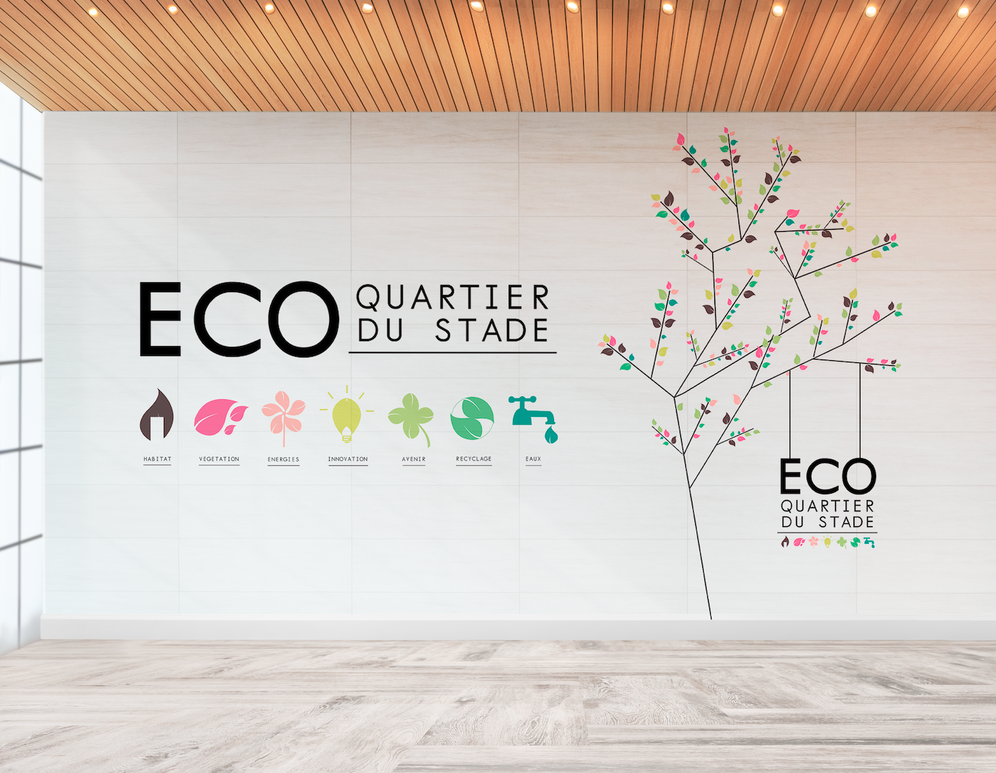
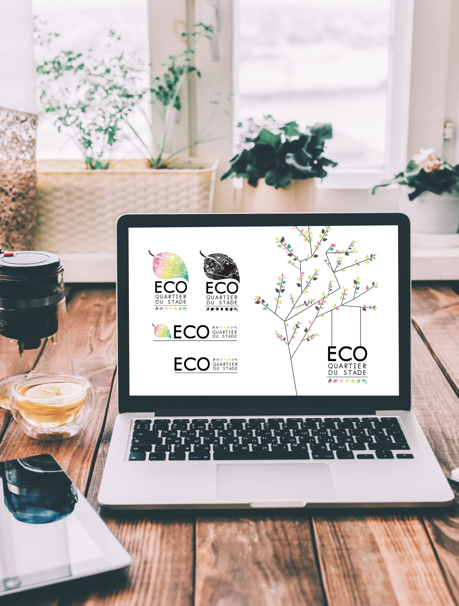
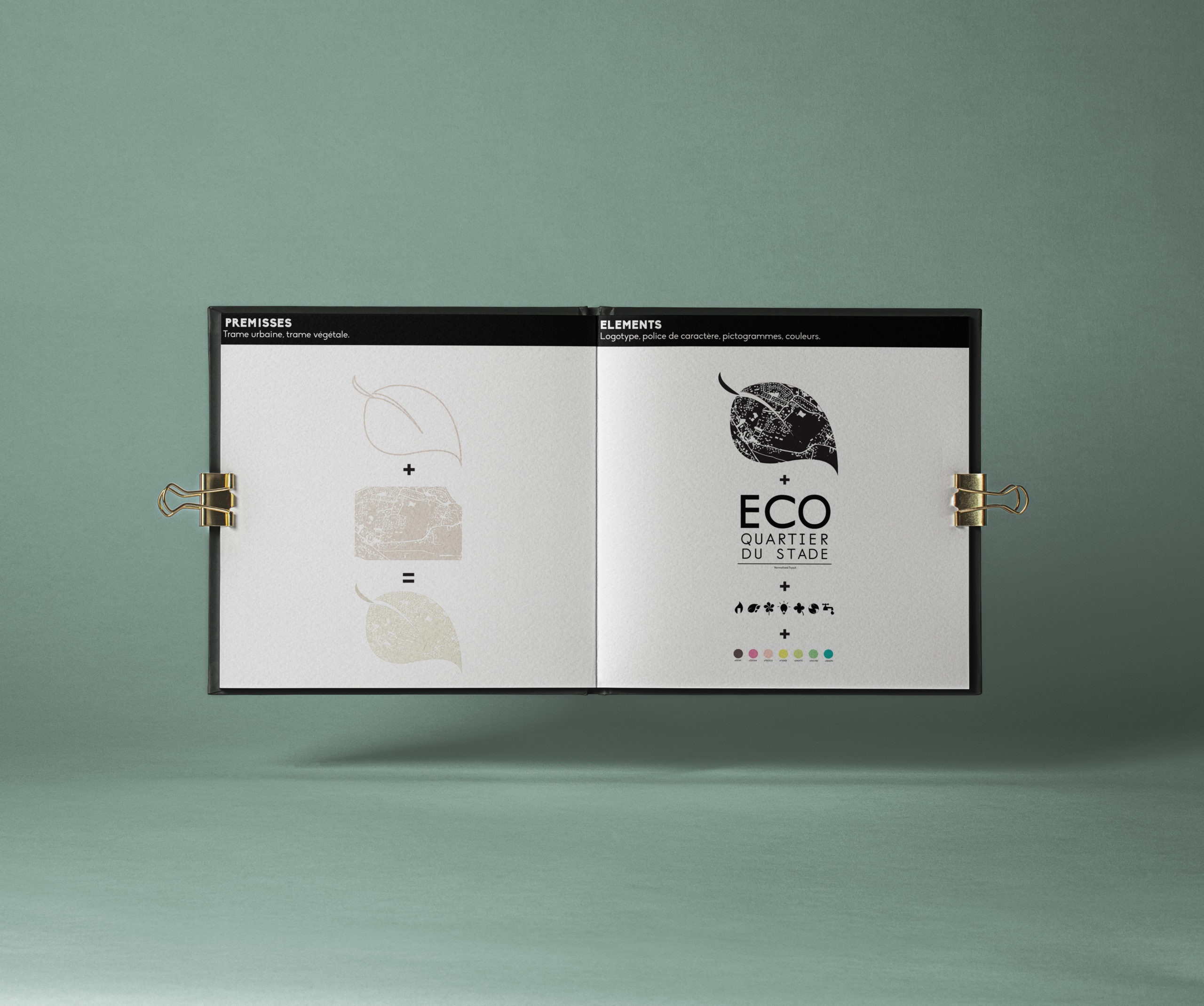
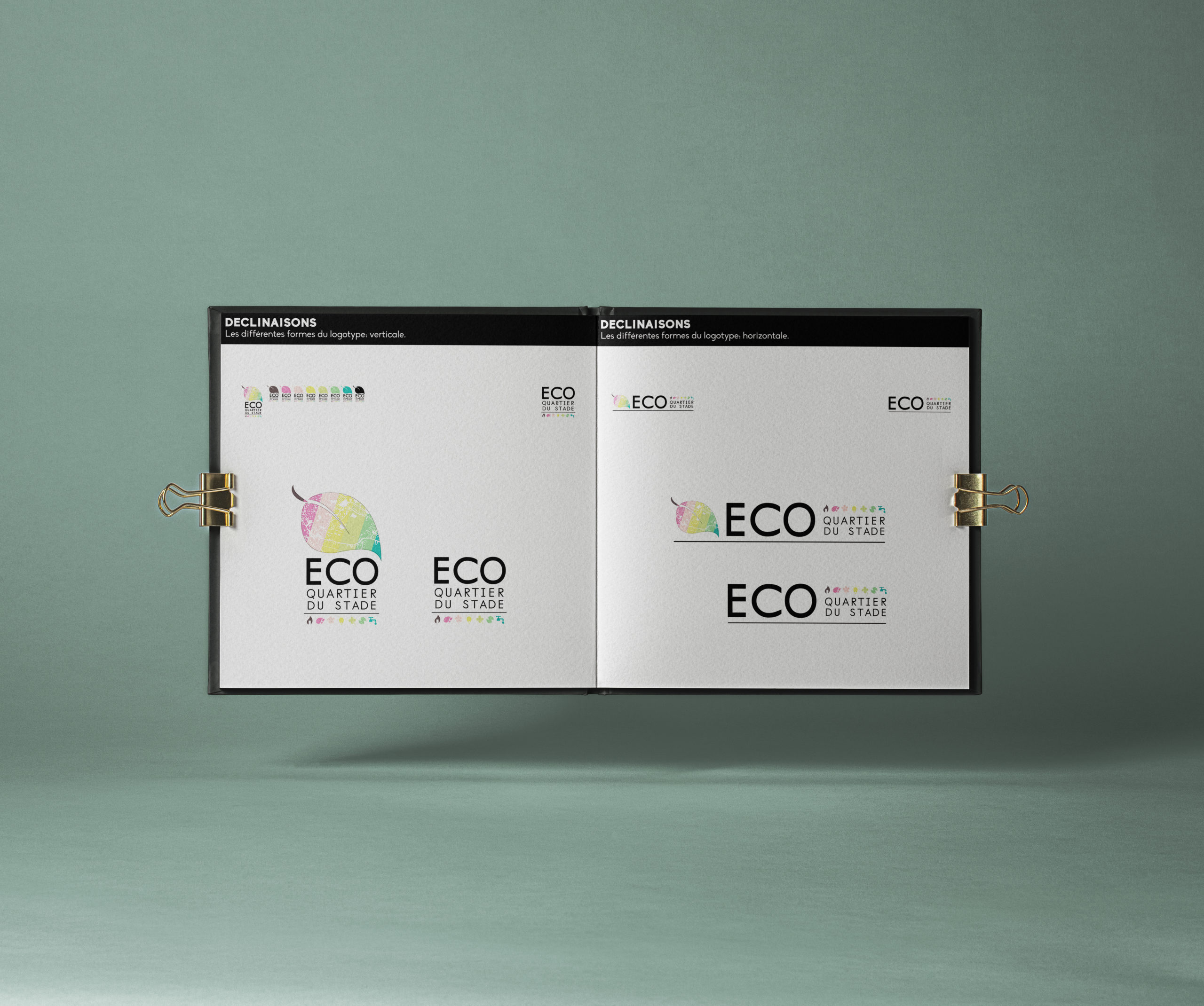
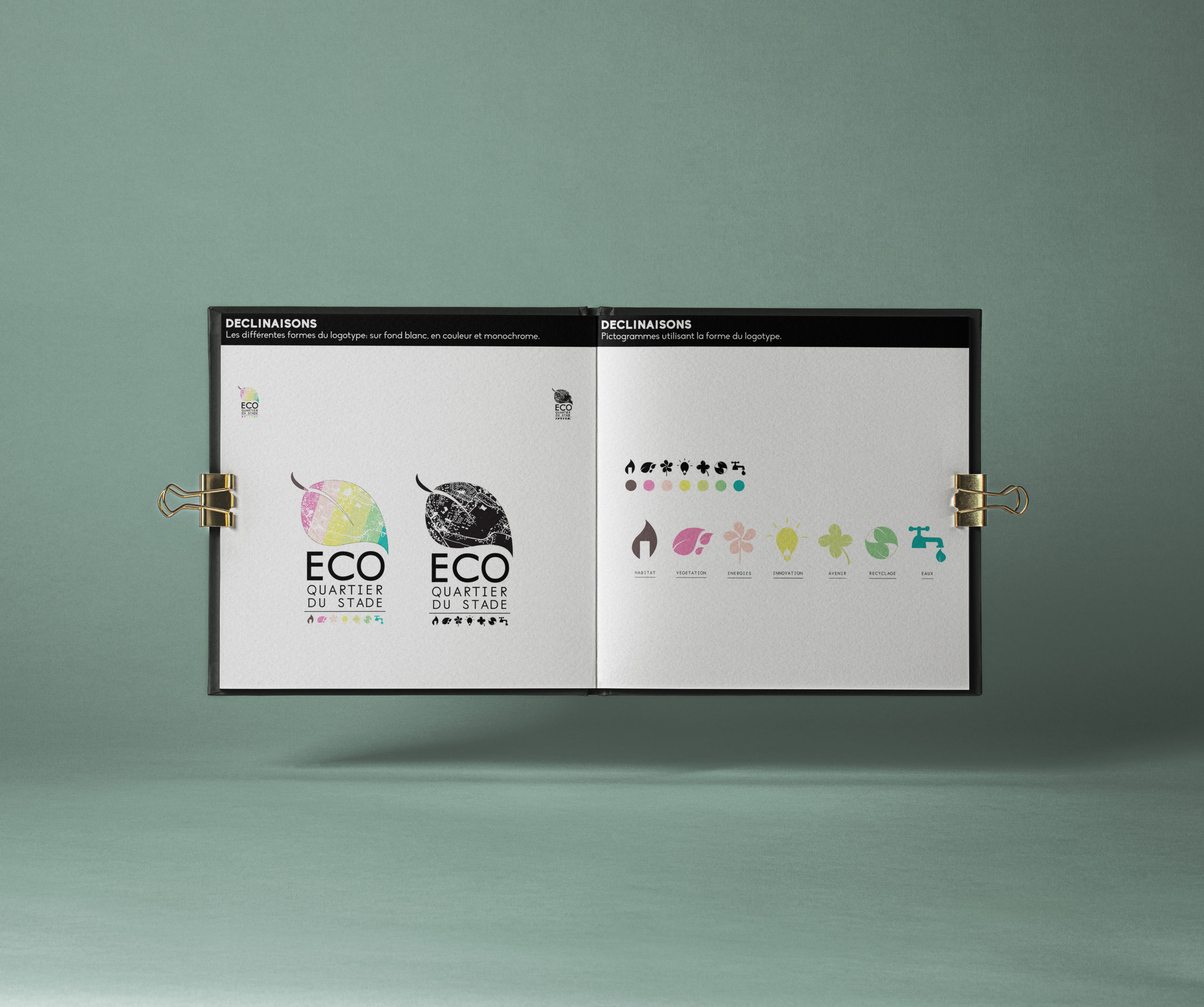
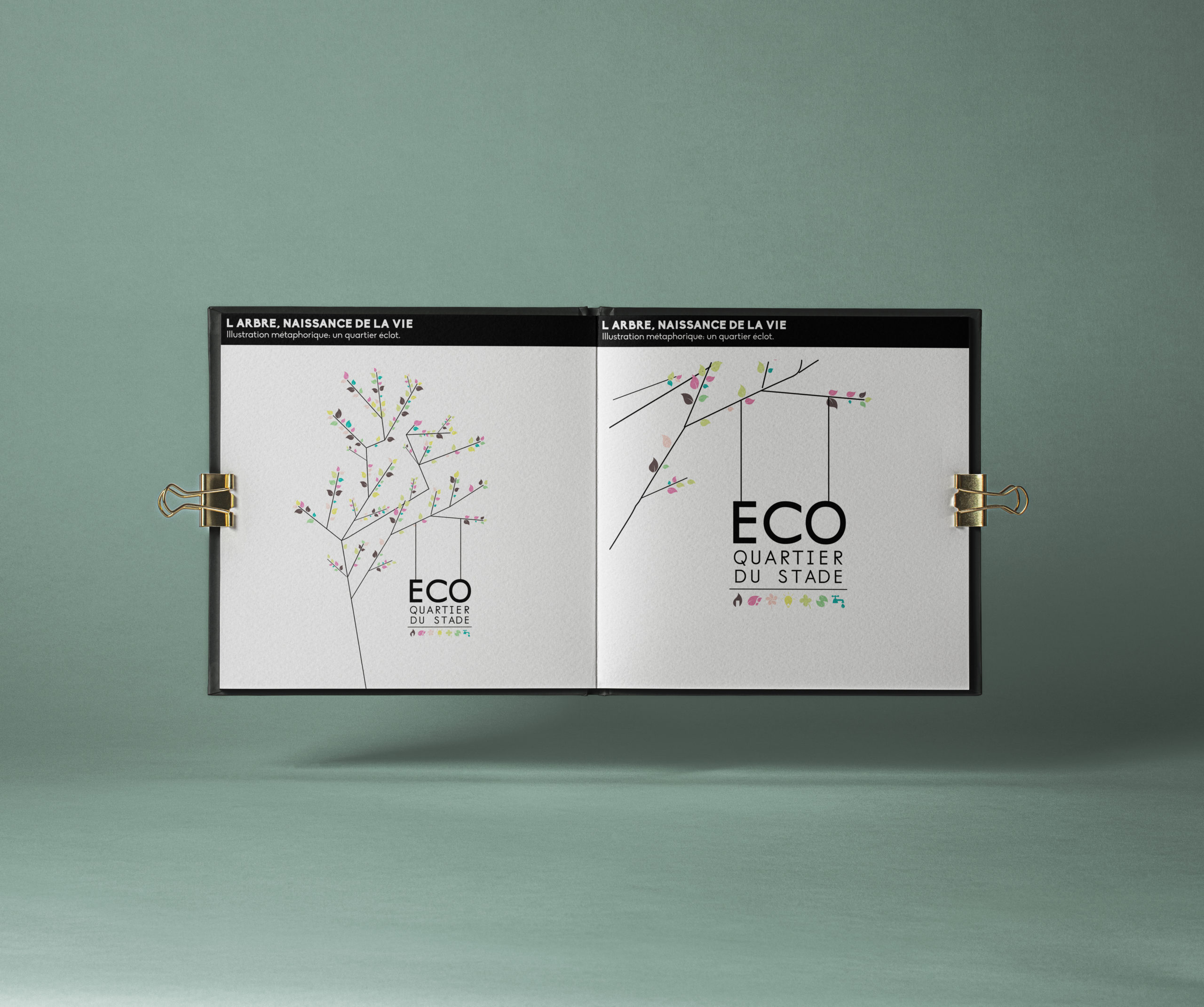
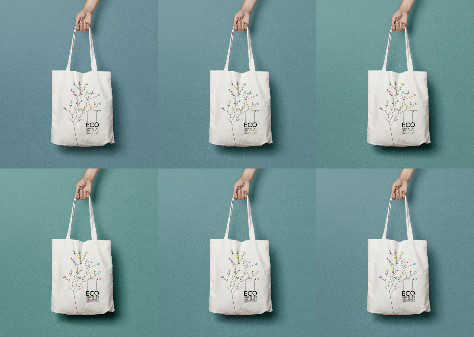
Combining urban pattern with a vegetal leaf, I’ve work on a concept of synergy among these symbols. I’ve developed this organic and modern graphic chart, with a very constructed process: using the real map to make the logo, creating various versions of it to enable an easy use. Colours have been chosen for their light and softness, inspiring a peaceful place. Still using this leaf shape, I’ve drawn different icons, highlighting a message of simplicity and efficiency. All these icons reveal the divers area of eco-innovation built by this neighborhood. The overall illustration is a tree, the tree of life, a metaphor of the booming neighborhood.
Brand owner
Mission
Art direction, Graphic design, concept.
Design by
Marion Quesson
Date
22 mai 2022